


Snapshot
Who is Velosaty?
Velosaty is dedicated to empowering student-athletes as they navigate life beyond sports. By aligning athletic and academic ambitions, Velosaty facilitates personalized 1-1 mentorship experiences through an intuitive website and dashboard, guiding athletes in their academic and professional journeys.
My Contribution:
At Velosaty, I focused on translating research insights into cohesive design strategies to craft impactful user experiences. My contributions included designing key pages, design and update the design system for consistency and efficiency, and creating the landing pages for the website. For the MVP, I designed the mentee dashboard, ensuring functionality and user-centric design refinement.
Role:
Product design
Duration:
Aug’23 - Present
S/W Used:
Figma, Google Suites, Slack, Zoom
Documents linked to this case study:
Other connected projects:
Case Study Outline
Project Overview
01Research
02The research aimed to:
- Identify the core pain points and needs of student-athletes regarding career preparation and mentorship.
- Understand the key success factors and best practices for effective mentorship programs.
- Analyze the competitive landscape of existing mentorship platforms and services.
- Define user goals and develop user personas to guide design.
Research Methodology:
A multi-faceted research approach was employed, combining both qualitative and quantitative methods to gain a comprehensive understanding of the problem space.
-
Literature Review
- An in-depth literature review was conducted to establish a foundation of knowledge.
- Sources included academic research, industry reports, and case studies of successful mentorship programs.
- Key insights were gathered on mentorship best practices, potential pitfalls, and critical success factors.
-
User Interviews
- Qualitative data was gathered through user interviews with both mentors and mentees involved in mentorship programs.
- These interviews focused on understanding their needs, expectations, motivations, and pain points related to mentorship.
- Over 20+ user interviews were conducted.
-
Surveys
- Surveys were distributed to a wider audience of student-athletes to collect quantitative data on demographics, career interests, support systems, and preferences for mentorship.
- This helped to validate qualitative findings and provide statistical context.
- Surveys were distributed to gather quantitative data.
-
Competitive Analysis
- A competitive analysis was performed to evaluate existing mentorship platforms and services, including both direct and indirect competitors.
- This analysis identified strengths, weaknesses, opportunities, and threats (SWOT) in the competitive landscape.
- The findings helped shape the platform's unique value proposition.
-
Market Research
- Market research was conducted to understand the broader context of career development resources for student-athletes.
- The research also aimed to identify potential partnerships or collaborations.
Key Research Findings:
-
Time Constraints
Student-athletes face significant time limitations due to demanding schedules and often rely on structured environments for success.
-
Lack of Support
Students from lower socioeconomic backgrounds often lack adequate career guidance and resources, impacting their post-college success.
-
Flexibility
Both mentors and mentees value clear program structure coupled with flexibility, emphasizing the importance of face-to-face interaction (e.g., video calls).
-
Comprehensive Support
Successful mentorship extends beyond one-on-one guidance, including access to resources like mental health support, networking, and professional development opportunities.
Challenges and Refinements
03To ensure our solutions were impactful and aligned with both user and business needs, I mapped each challenge to its corresponding design response and measured outcomes. This matrix highlights the strategic decisions made and their tangible results.
| Focus Area | Challenge | Solution | Impact |
|---|---|---|---|
| Design Consistency | No existing design system; inconsistent visuals and UX | Built a comprehensive design system (typography, colors, components) | Improved visual cohesion, faster UI decisions, and scalable design for future growth |
| Timeline Constraints | Launch timeline drastically shortened due to real-world demands | Prioritized MVP features like mentorship matching and dashboards | Delivered functional core product on time; planned enhancements for future iterations |
| User Value | Limited resources and time to deliver full product vision | Focused on features with immediate value to student-athletes | Created an impactful MVP that directly addressed user pain points |
| Cross-team Workflow | Risk of misalignment and inefficiencies in design-to-dev handoff | Established strong stakeholder/dev collaboration with detailed specs and documentation | Minimized back-and-forth, ensured dev alignment, preserved design intent during implementation |
User Pathways
04To design an intuitive and efficient mentorship experience for both mentees and mentors, I began by mapping their journeys through the platform. This helped identify pain points, align user needs with business goals, and clarify the critical paths for engagement. The following diagrams illustrate:
- The user journey maps and site maps outlining key touchpoints.
- Detailed user flows and task/activity flows for core tasks like account creation and mentorship requests.
- How user insights informed interaction models and design prioritization.


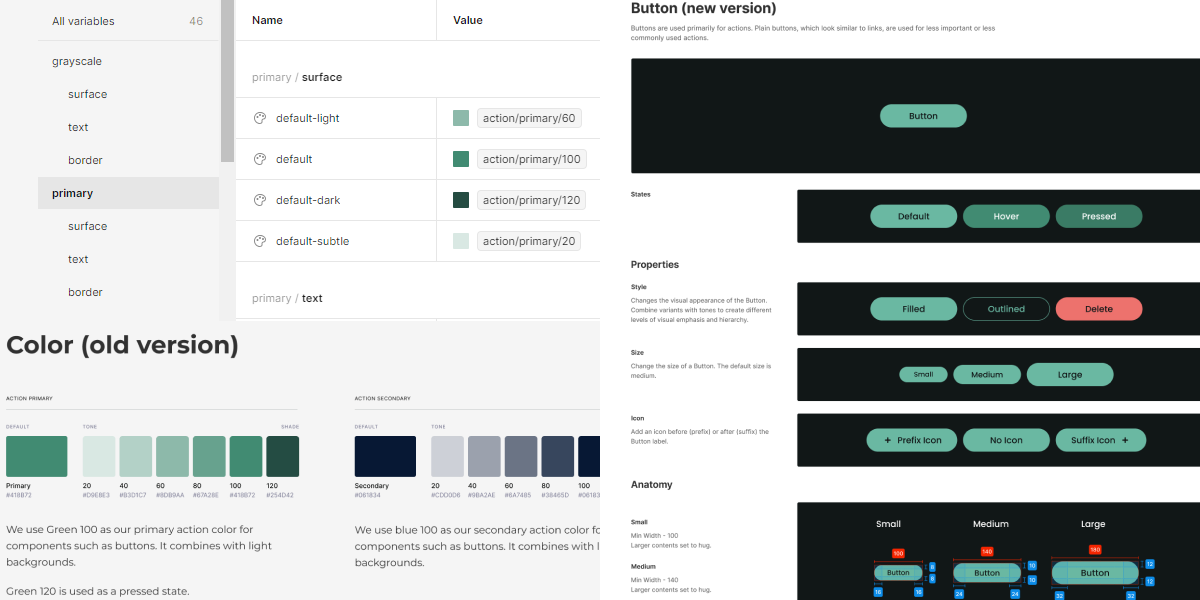
Improving Design Systems Consistency
05As I worked on the project, I noticed inconsistencies within the design system and took the initiative to suggest and advocate for improvements. I focused on simplifying and streamlining components, addressing redundancies, and ensuring better consistency throughout the system. Key updates included:
- Refining button components for better flexibility and smoother handoffs.
- Improving the color system for consistency and scalability.
- Enhancing text fields for more versatility and functionality.
These changes ultimately led to a more efficient, consistent, and user-friendly design system.
Design Iteration
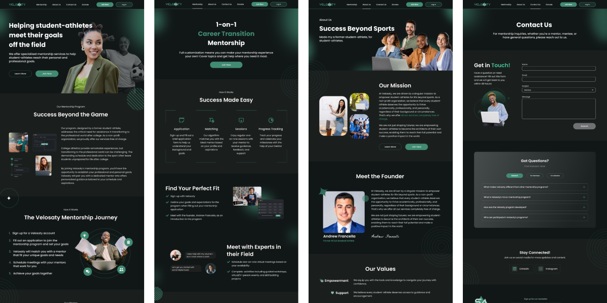
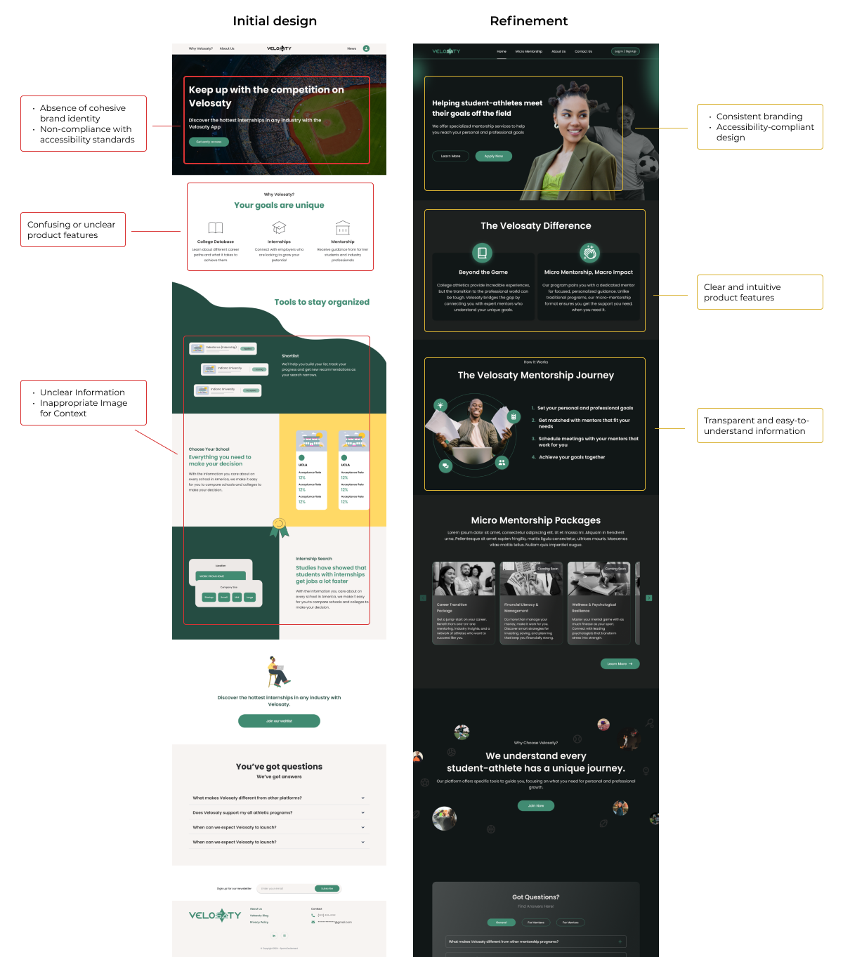
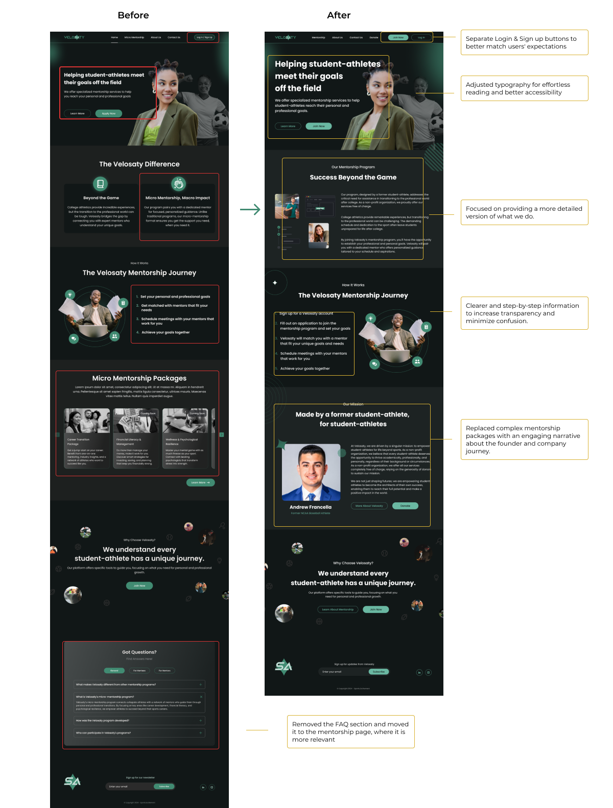
06Through ongoing collaboration, design feedback, and a focus on user and business needs, we redefined the visual identity for all landing pages and overall platform design. This comprehensive update established a consistent, clear, and engaging aesthetic, improving user experience while aligning with our brand vision. Through collaboration and iterative design, we ensured that every element contributed to a cohesive and effective user interface, fostering stronger connections with our audience.
Landing page
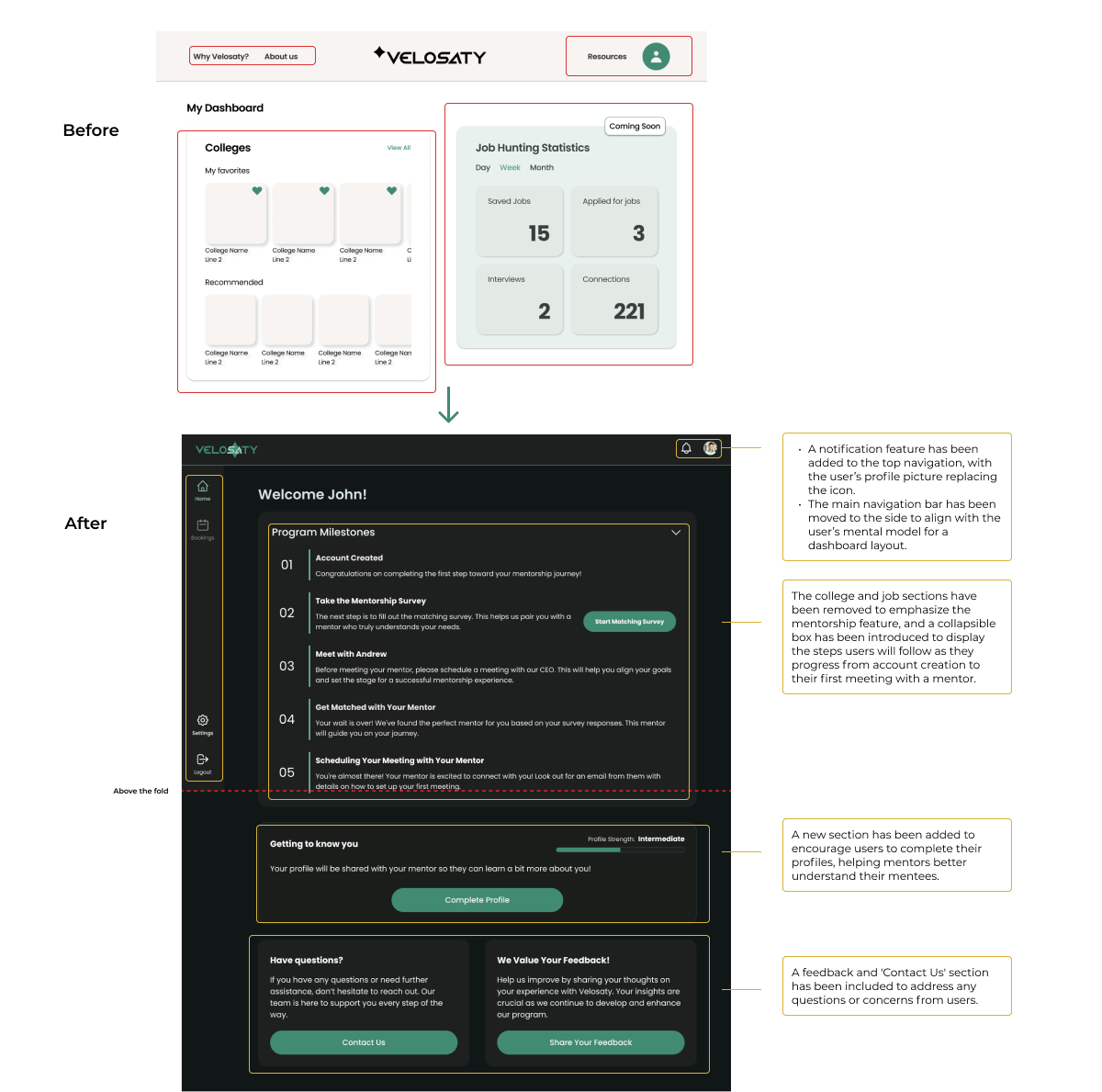
Dashboard (MVP)
This dashboard design is based on prior business goals, incorporating features like college search, internships, and mentorship. However, as we rethought our approach using user insights and collaboration, we decided to prioritize mentorship as the core feature.
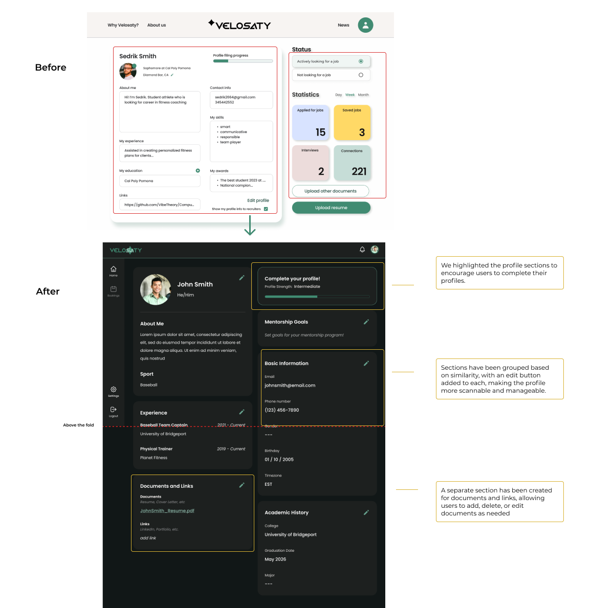
Profile
As the business goals evolved, we removed irrelevant sections from the profile and improved existing ones, while adding new elements to better complement the overall experience.
Usability Testing
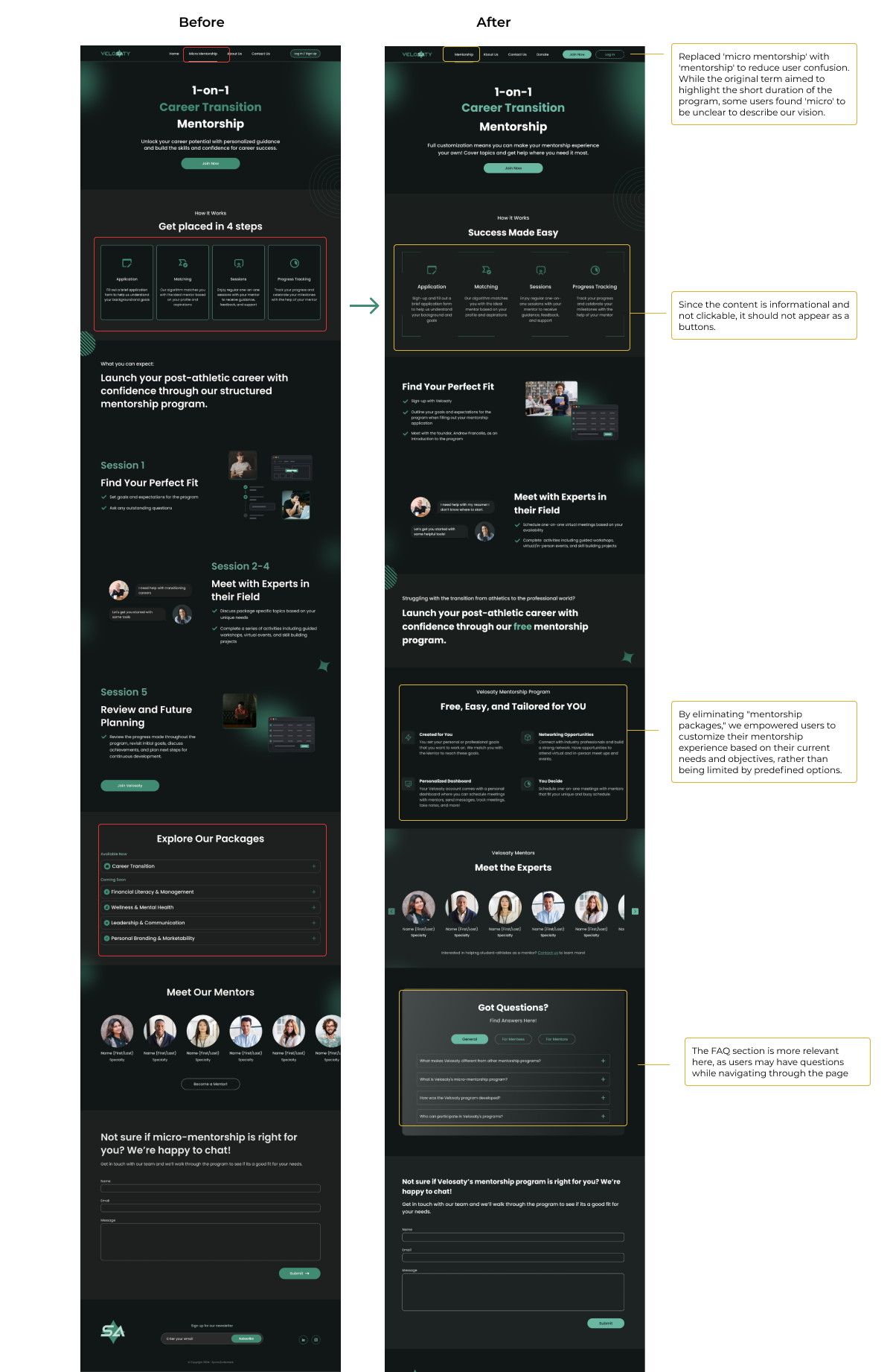
07Usability testing on our four main landing pages revealed key areas of user difficulty and confusion. These findings underscored opportunities for improvement to create a more seamless and intuitive user experience.
Landing page
Mentorship page