


Snapshot
Who is Velosaty?
Velosaty is dedicated to empowering student-athletes as they navigate life beyond sports. By aligning athletic and academic ambitions, Velosaty facilitates personalized 1-1 mentorship experiences through an intuitive website and dashboard, guiding athletes in their academic and professional journeys.
My Contribution:
As part of a platform enhancement initiative, I led the update of an existing design system and developed comprehensive design guidelines to streamline collaboration, improve consistency, and ensure scalability.
Role:
UX/UI design
Duration:
Aug’23 - Present
S/W Used:
Figma, Google Suites, Slack, Zoom
Documents linked to this case study:
Other connected projects:
Case Study Outline
Project Overview
01Button Component Enhancements
02-
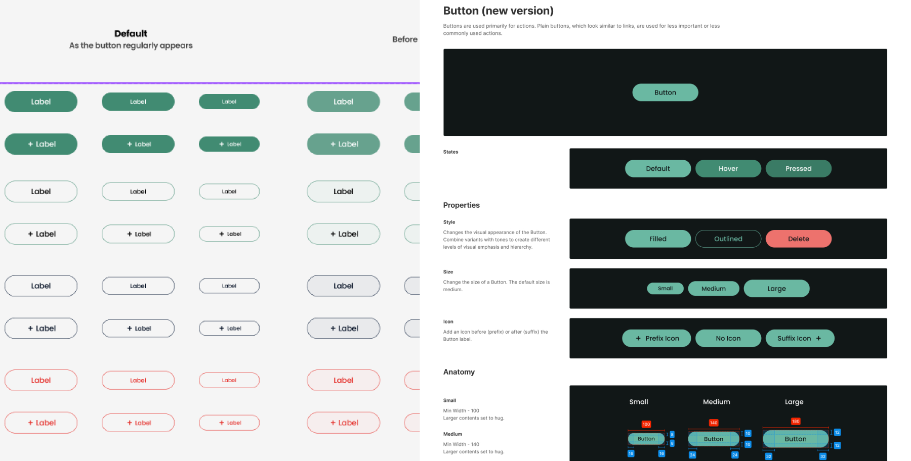
Old Button Component (Issues):
Limited versatility, no support for icons or label toggling, unclear hierarchy, and inconsistent spacing. This often led to challenges during the handoff process and hindered usability.
-
Updated Button Component (Improvements):
The revamped button component supports multiple styles and sizes, includes icons and label toggling, and enforces clear hierarchy with consistent spacing. A well-documented spec sheet further ensures usability and seamless handoffs, improving both aesthetics and functionality.
Color System Enhancements
03-
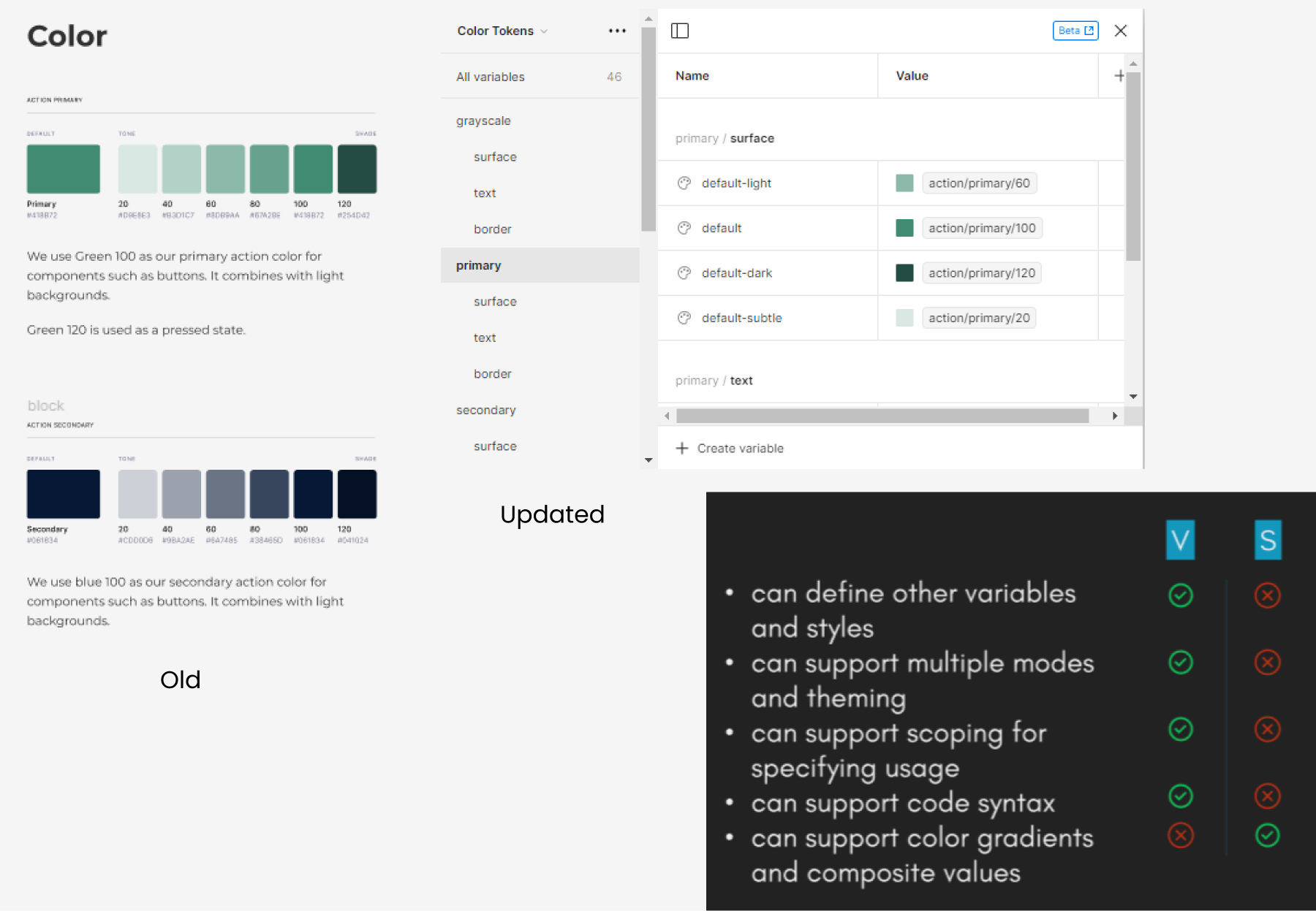
Old Color System (Issues):
Colors were managed through individual styles for each component, causing redundancy and inconsistency. This approach complicated maintenance and lacked scalability.
-
Updated Color System with Primitives and Tokens (Improvements):
Introduced base colors (primitives) referenced through tokens, ensuring consistency and flexibility. Updates to primitives propagate across the system, streamlining maintenance and enabling easy theme adaptations for scalability and efficiency.
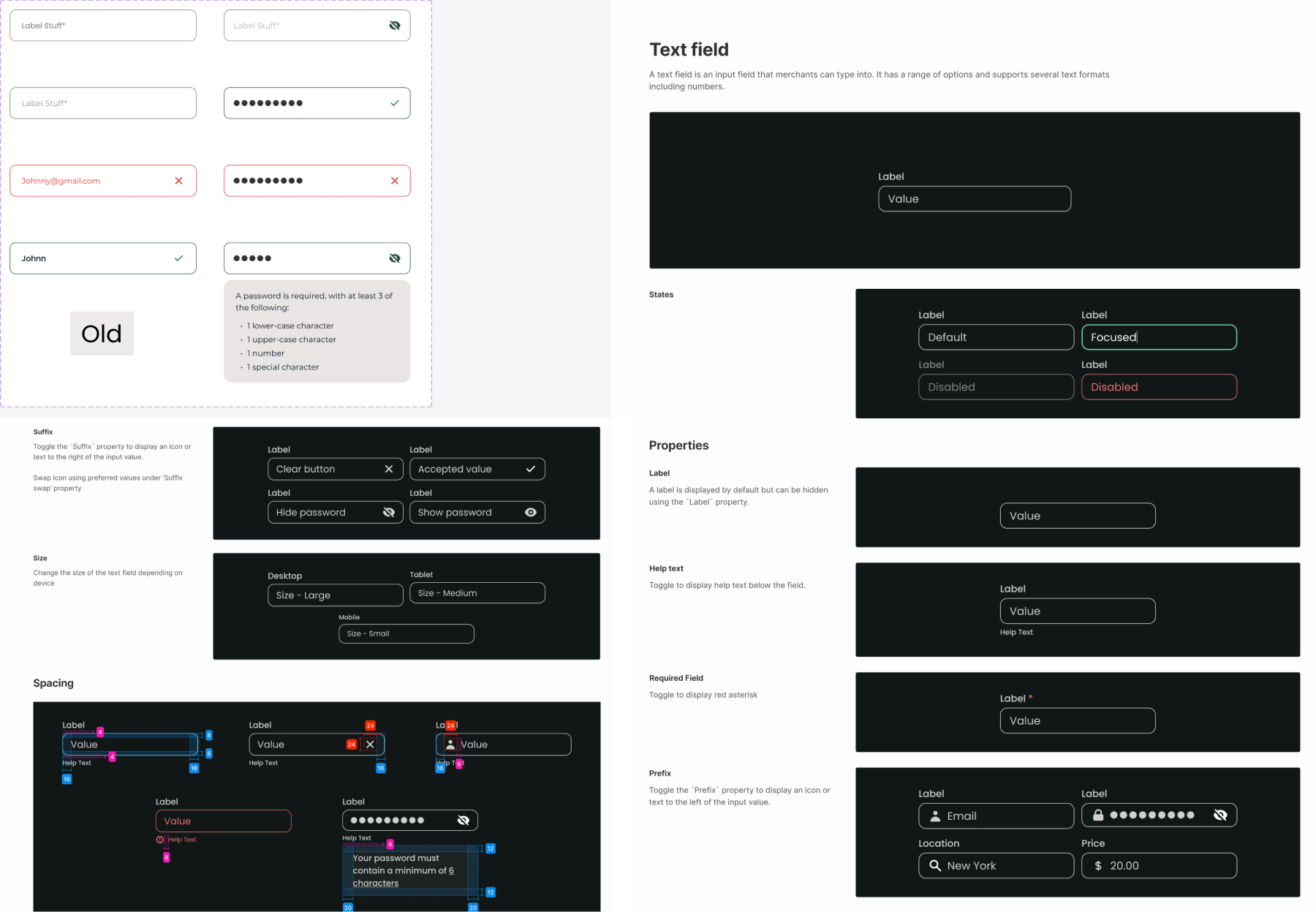
Input Field Component Enhancements
04-
Old Input Field (Issues):
Separate components for input, password, and dropdown fields lacked versatility, icon support, and customization options like labels and toggles.
-
Updated Input Field (Improvements):
A single versatile component now supports multiple use cases, including input, password, and dropdown fields. It accommodates icons, labels, toggles, prefix/suffix icons, and different sizes and states. Helpful text ensures usability across various contexts like email and password inputs.
Typography System Enhancements
05-
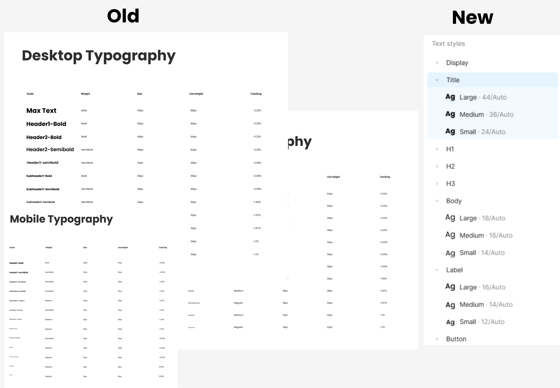
Old Typography System (Issues):
The previous typography system included a separate set of headers, body text, and other styles for mobile, desktop, and tablet versions. This led to numerous variations and excessive font weights, often resulting in inconsistent usage and confusion. Additionally, the complexity made it inconvenient for developers to implement effectively.
-
New Typography System (Improvements):
The updated system simplifies typography with a minimal set of styles: three headers, body, label, display, title, and button text. Each style includes three size options (small, medium, large) for flexibility. Device-specific font segregation was removed to enhance versatility. This streamlined approach reduces confusion and ensures seamless implementation for both designers and developers.