


Snapshot
What is SONNY?
SONNY (ShopOnlineNewYork.com) is a B2B2C e-commerce platform designed for the state of New York. The platform facilitates direct sales of products from manufacturers and distributors to end-users, catering to both individual and bulk purchase needs. It focuses on streamlining the buying and selling experience while addressing the unique requirements of end-users.
My Contribution:
At SONNY, I focused on creating seamless user experiences by designing wireframes and mockups for buyer and seller interfaces across desktop and mobile platforms. My contributions included developing user flows to optimize navigation, creating and maintaining a cohesive design system, and refining designs based on user testing and feedback. I actively participated in review sessions to ensure the platform aligned with project goals and user needs.
Role:
UX/UI design
Duration:
May’23 - Jan’24
S/W Used:
Figma, Google Suites, Slack, Zoom
Documents linked to this case study:
Case Study Outline
Project Overview
01User Research by research team
02Based on research insights provided by the research team, several user pain points were identified and documented.
-
Checkout process
Where users express frustration with complicated steps, hidden fees, and a lack of transparent information
-
Delivery-related concerns
Such as delayed shipping times and unclear tracking updates, contribute to a negative user experience
-
Personalization
Difficulties in finding localized products and personalized recommendations that align with their preferences
-
Customer support
Responsiveness and issue resolution also emerge as pain points, with users desiring quicker and more effective assistance
User Flow
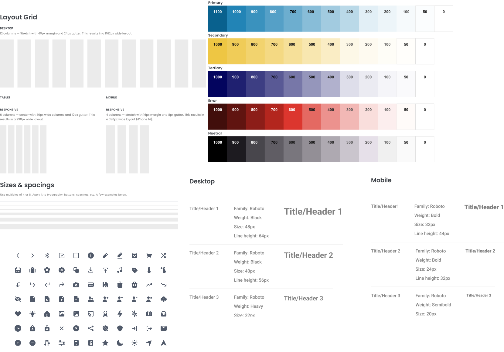
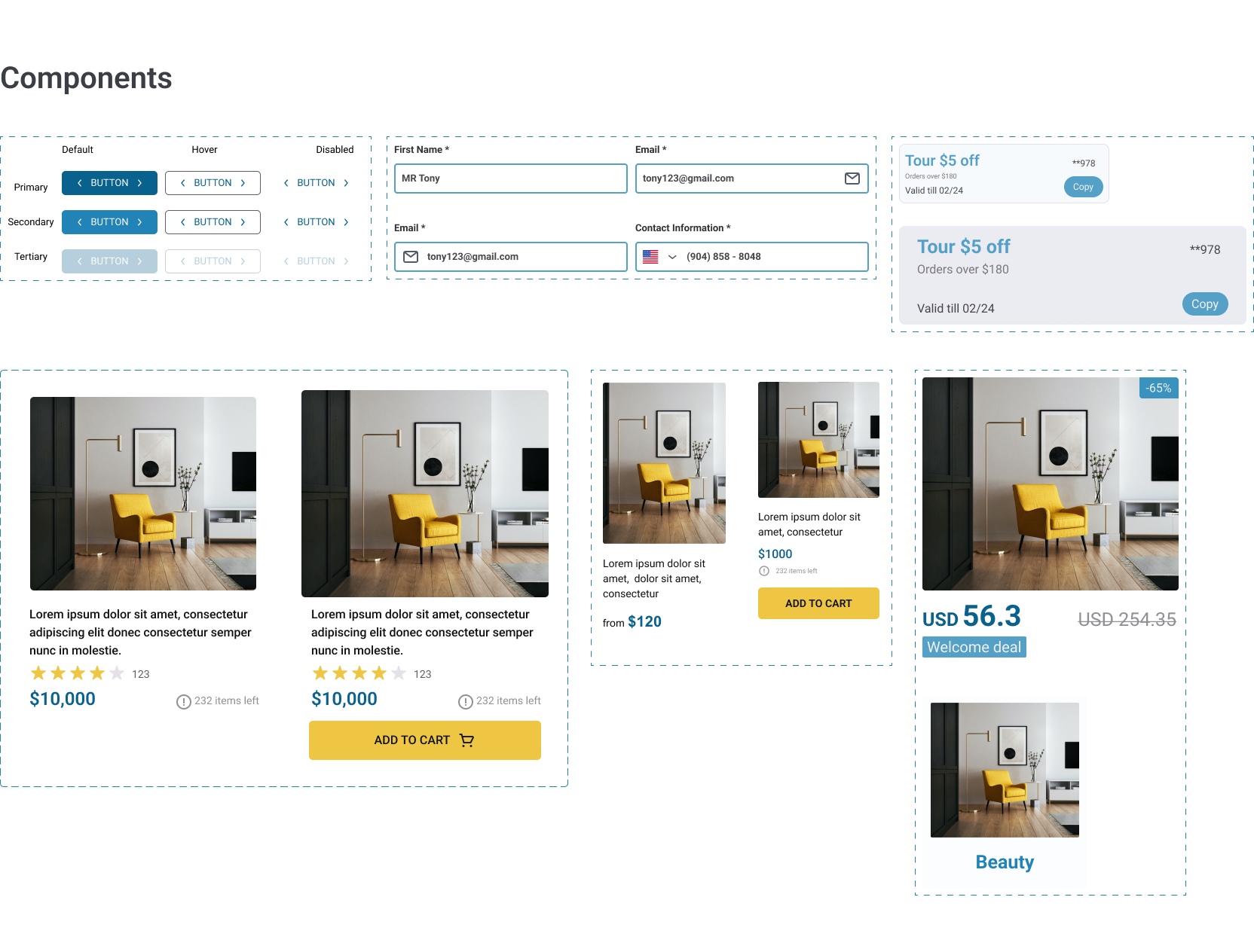
03Improving Design Systems Consistency
04As I contributed to the project, I observed that certain areas of the design system required updates to enhance consistency, scalability, and usability. To address this, I took the initiative to review and refine the design system, ensuring it was aligned with the project's evolving needs and user experience goals. Key updates included:
- Improved Consistency Across Pages: Identified pages requiring updates and implemented design system modifications to ensure uniformity across the platform.
- Enhanced Reusability: Streamlined components and styles to make the design system more efficient and adaptable, supporting faster development cycles and reducing redundancies.
- Collaboration with Cross-Functional Teams: Actively engaged with stakeholders to gather feedback, address challenges, and ensure the updated design system met diverse requirements.
These refinements not only improved the overall user experience but also created a more cohesive and scalable foundation for future updates and growth.
Design Iteration & Usability Testing
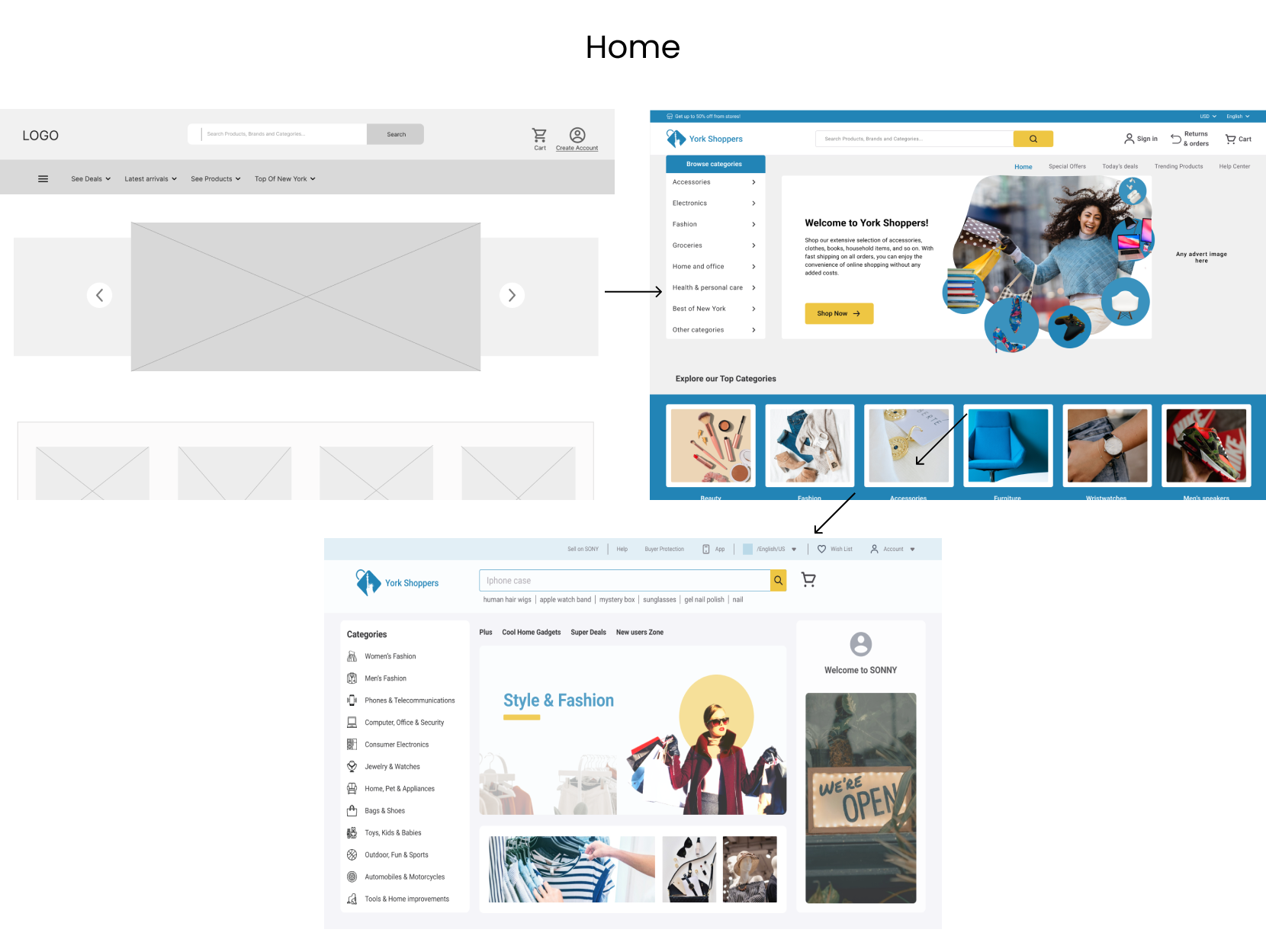
05Following usability testing and user feedback, we made several iterative improvements to enhance the user experience for both the BUYER and SELLER interfaces. Key updates include:
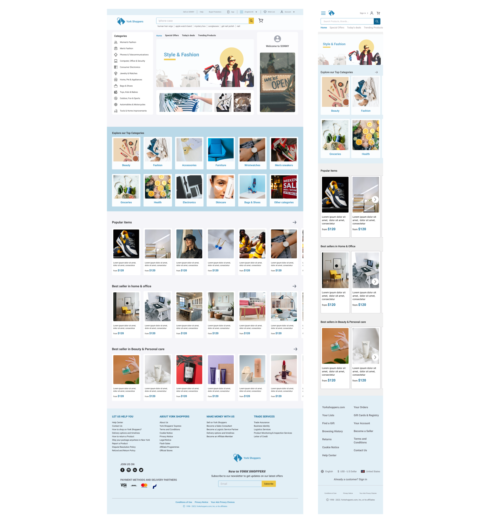
BUYER Homepage Enhancements:
-
Improved Navigation:
Added product categories to the left sidebar for easier access and better navigation for shoppers.
-
Prioritized Key Features:
Placed frequently used features like account, cart, and wish list prominently at the top of the navigation bar.
-
Streamlined Search Experience:
Displayed popular searches under the search bar to help users quickly find what they need.
-
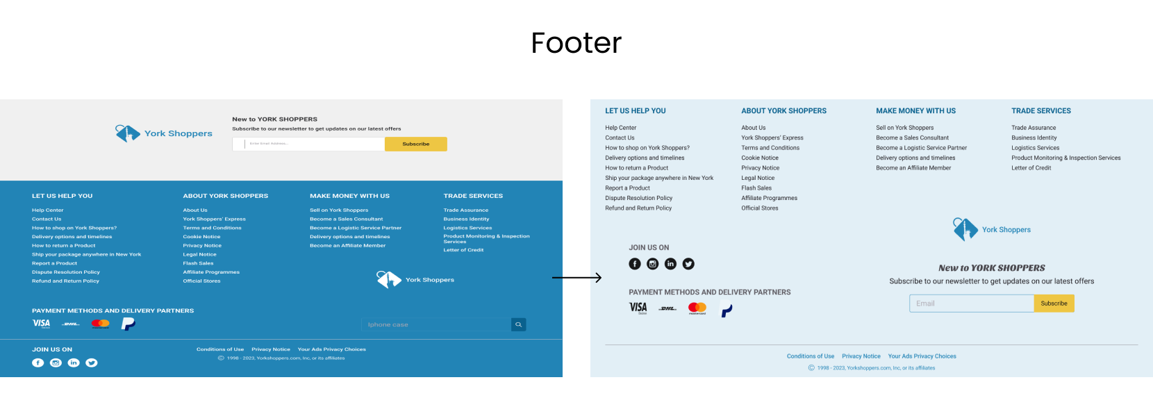
Footer Refinements:
Made the footer more user-friendly by reorganizing content and integrating the subscription section into it for a cohesive design.
-
Space Optimization:
Removed unnecessary elements like the standalone subscribe section, improving visual balance and usability.
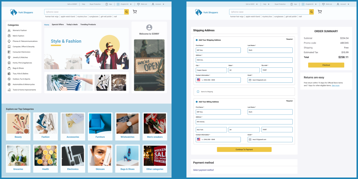
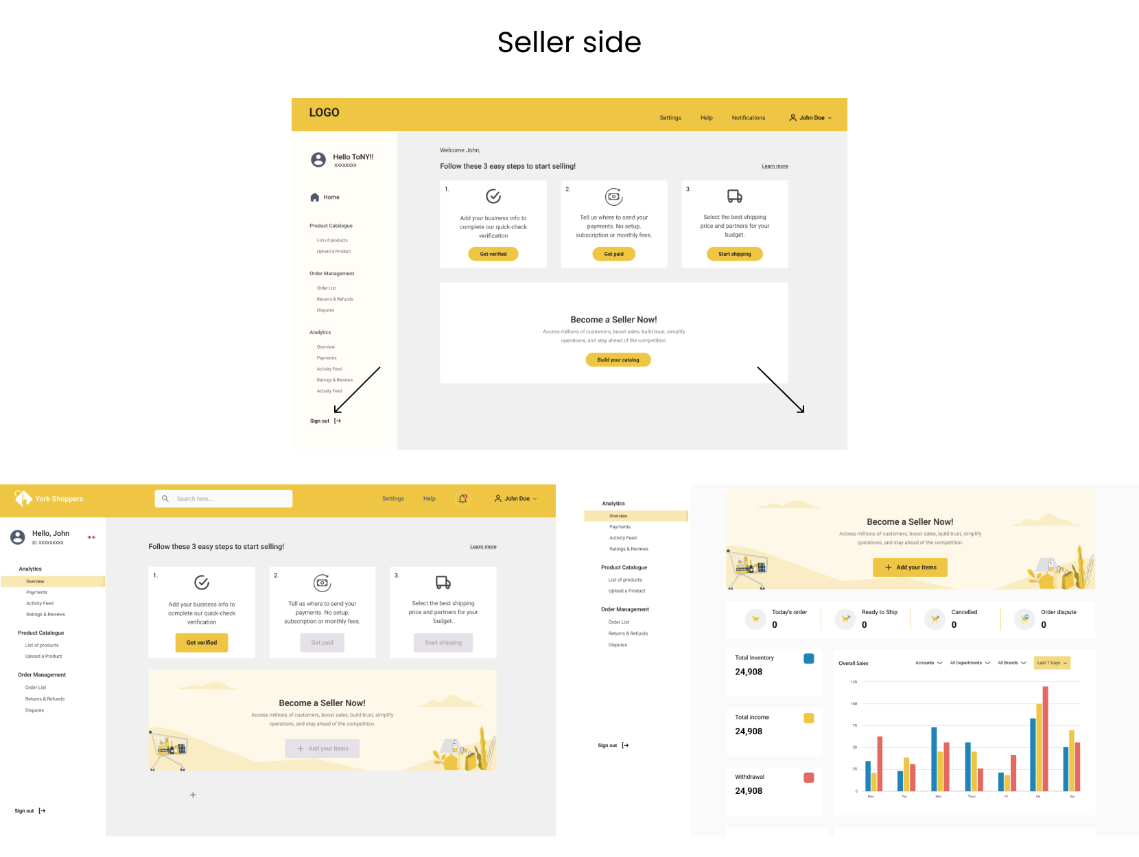
SELLER Dashboard Improvements:
-
Simplified Onboarding Process:
Initially, the SELLER dashboard included four primary CTAs for onboarding (e.g., "Get Verified," "Select Payment Method"). Users found this confusing, so we emphasized the "Get Verified" step as the primary action, graying out the others to guide the process effectively.
-
Dynamic Content Update:
Recognized that once sellers completed onboarding tasks (verification, payment, and shipping setup), these steps were redundant. Added a new page to display relevant data like orders, inventory, and financial summaries, providing a more streamlined and actionable experience.
-
Effortless Product Management:
Introduced an "Add Items" CTA button allowing sellers to upload products, stored as drafts until verification was completed, ensuring a seamless transition into their active catalog.
Responsive Wesbite Mockup
06